
Creative Elements 3.16: A New Era of Web Design with Containers

Building powerful PrestaShop pages shouldn't require a complicated page structure. Creative Elements 3.16 introduces a more modern way to build and render your pages. With Flexbox Containers, Optimized DOM Output, and smarter asset loading, you can create the same designs with a cleaner structure and fewer unnecessary resources.

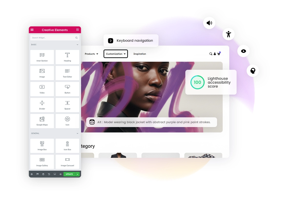
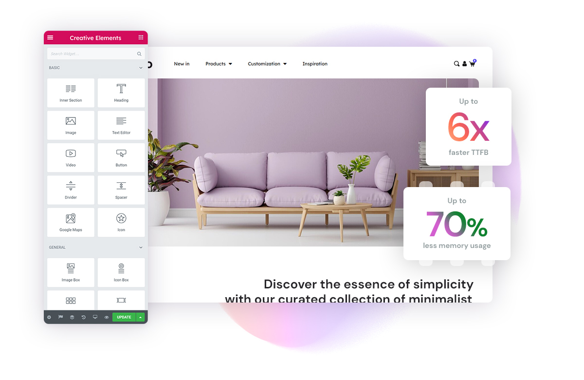
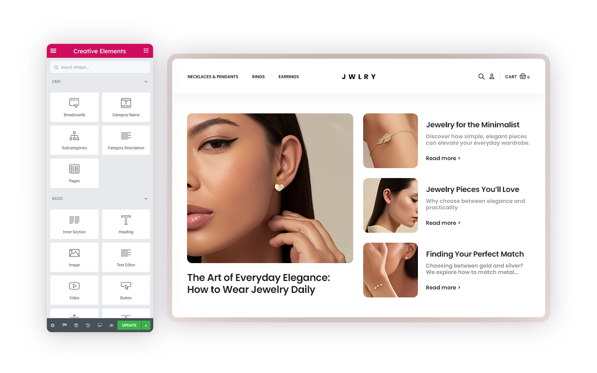
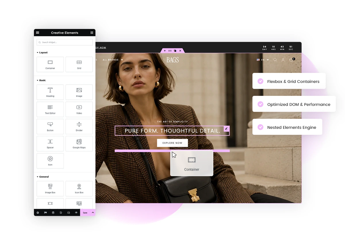
Creative Elements 3.16 editor with new design and layout features

A Much Cleaner Page Structure

One of the biggest improvements in Creative Elements 3.16 happens behind the scenes.

Until now, even a simple layout could require several structural layers before reaching the actual content. As pages become more complex, these additional wrappers can increase both the number of HTML elements and the depth of the DOM.

Creative Elements 3.16 introduces a much leaner way to structure your pages, reducing unnecessary markup and creating a cleaner, shallower DOM.

Creative Elements v2.14
9 HTML elements
1234567891011121314151617
<section class="elementor-element elementor-section elementor-top-section">  <div class="elementor-container elementor-column-gap-default">    <div class="elementor-row">      <div class="elementor-element elementor-column elementor-col-100 elementor-top-column">        <div class="elementor-column-wrap elementor-element-populated">          <div class="elementor-widget-wrap">            <div class="elementor-element elementor-widget elementor-widget-image">              <div class="elementor-widget-container">                <img src="/modules/creativeelements/views/img/placeholder.png" loading="lazy">              </div>            </div>          </div>        </div>      </div>    </div>  </div></section>
Before: HTML structure in Creative Elements 2.14

The traditional structure uses several wrappers around the actual widget. These layers add up as layouts become more complex.

Creative Elements v3.16
4 HTML elements
1234567
<section class="elementor-element e-con-full e-flex e-con e-parent">  <div class="elementor-element elementor-widget elementor-widget-image">    <div class="elementor-widget-container">      <img src="/modules/creativeelements/views/img/placeholder.png" loading="lazy">    </div>  </div></section>
After: Cleaner HTML structure possible with Creative Elements 3.16

In this simple example, the structure goes from 9 HTML elements to just 4, resulting in 56% fewer HTML elements for the same content.

The exact reduction will vary depending on the structure and complexity of each page, but the principle remains the same: fewer required wrappers mean a cleaner, shallower DOM.

Improvements to Sections & Columns

The existing Section and Column system has been improved in Creative Elements 3.16.

Your current pages remain fully supported and continue to work as before. By enabling the new Optimized DOM Output option, Creative Elements can simplify their generated HTML by removing unnecessary wrapper elements where possible.

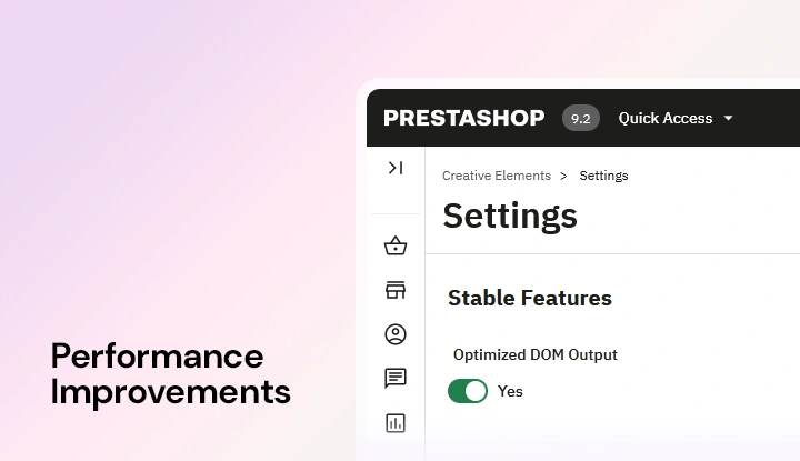
Optimized DOM Output option in Creative Elements Features settings
Optimized DOM Output for Sections and Columns

This means you can achieve a cleaner, shallower DOM with your existing Section and Column layouts, without rebuilding your pages or changing the way they are designed.

Meet Flexbox Containers

Optimized DOM Output makes the existing Section and Column system leaner. But what if we could go even further?

To reduce the number of required structural layers even more, Creative Elements 3.16 introduces Flexbox Containers, a new layout option available alongside Sections and Columns.

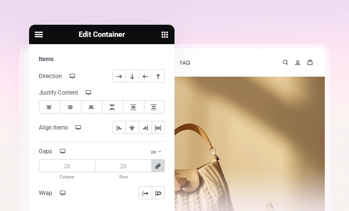
Flexbox Container layout settings for direction and alignment
Add a new Flexbox container

Containers are available alongside Sections and Columns, so nothing changes for your existing pages. You can continue using your current layouts as before and start using Containers wherever they make sense for new or existing designs.

With Containers, widgets can be placed directly inside a Container without requiring a separate Column. Containers can also be nested inside other Containers whenever additional structure is needed.

Sections & Columns
Traditional
Section
Column
Widget
Containers
New
Container
Widget

The result is fewer required layers and more direct control over your layouts.

Flexbox Containers vs. Sections & Columns

Flexbox Containers give you more direct control over how elements are arranged, aligned, sized, and distributed.

Flexbox ContainersSections & Columns
StructureWidgets can be placed directly inside a Container, without requiring an additional Column.Widgets need to be placed inside a Column, which itself belongs to a Section.
Widget widthWidgets are inline by default, so multiple widgets can naturally sit next to each other inside the same Container.Widgets are full width by default and normally stack vertically inside their Column.
Layout directionArrange widgets horizontally or vertically using Row, Column, Row Reverse or Column Reverse.Layouts follow the traditional Section and Column structure, with less direct control over the direction of the elements inside them.
NestingPlace Containers inside other Containers to create more complex layouts only when you need them.More complex layouts usually require an Inner Section with additional Columns, adding extra structural levels to the page.
Responsive layoutsChange direction, alignment, order and sizing for different devices while keeping the same Container structure.Responsive adjustments are more limited and some layouts may require reversing Columns or creating additional structures.

Control Your Layout with Containers

Containers give you direct control over how widgets are arranged.

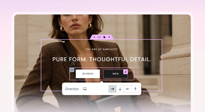
The Direction setting defines the basic layout. Choose Row to place elements next to each other horizontally, or Column to stack them vertically.

Layout controls for direction, alignment and spacing in a Flexbox Container
Container alignments

From there, you can control how the elements are distributed and aligned, adjust the gap between them, define their size, change their order, or allow them to wrap onto another line.

For example, placing four images in a row no longer requires a Section with four separate Columns. Add the images to one Container, set its direction to Row, and use the alignment and spacing controls to position them.

Build Responsive Layouts with the Same Container

One of the biggest advantages of Flexbox is how easily a layout can adapt to different screen sizes.

A Container can use Row on desktop and Column on mobile. You can also change alignment, order, spacing, sizing, and other settings for each device.

Instead of creating additional structures to make a layout work on mobile, you can adapt the same Container for different screen sizes.

Nest Containers for More Complex Layouts

Need something more advanced? Place Containers inside other Containers.

Each Container can have its own direction, alignment, size, and responsive settings. This makes it possible to combine horizontal and vertical layouts to create more complex structures without relying on multiple Sections, Columns, and Inner Sections.

Nested Flexbox Containers used to create more complex page layouts
Nested Containers

Keep the structure as simple as possible. Add nested Containers when your layout needs them, rather than adding extra layers by default.

Good to know: You don't need to rebuild your existing pages.

Existing Sections and Columns can be converted to Containers, so you can gradually modernize your layouts while keeping your existing designs.

Ready to Try Flexbox Containers?

Want to explore the new layout system before using it on your own pages?

Visit our Flexbox Container Playground to see how Containers work and experiment with the new layout controls.

We also prepared practical examples showing how existing Creative Elements layouts can be converted to Containers.

Convert a Header to Flexbox Containers
Convert a Homepage to Flexbox Containers

A Better Way to Manage Your Design

Keeping a consistent design across your entire store just became much easier.

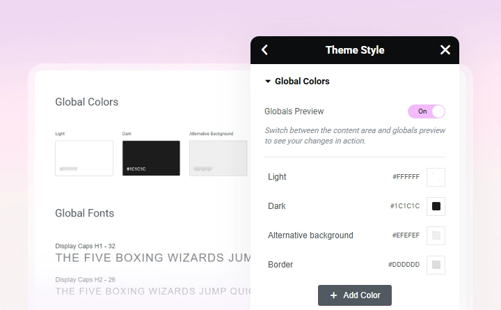
With Global Colors and Global Fonts, you can define your most important colors and typography once and reuse them throughout your Creative Elements designs.

Change a global style once, and every element using it follows the change. No need to go through your pages and update the same color or font over and over again.

We've also revamped Theme Style, bringing your site-wide styling settings directly into the Live Editor.

Spend less time repeating the same styling decisions and more time building your design.

Global design settings in the Creative Elements editor
Global Colors and Fonts in Creative Elements

Improved Asset Loading

Creative Elements 3.16 is smarter about what it loads on each page.

Widget JavaScript and third-party libraries are now loaded dynamically, so a widget's scripts and required libraries are only loaded when that widget is actually used on the page. This happens automatically, helping reduce unnecessary JavaScript without any additional configuration.

You can also enable Dynamic Library Loading to change how these libraries are delivered. When enabled, libraries are loaded asynchronously with JavaScript instead of being added to the page output by PHP, helping make resource loading even more efficient.

Swiper
Used on page ✓
Loaded
Sticky
Not used ×
Not Loaded

Together, these improvements reduce unnecessary frontend resources and help Creative Elements load only what each page actually needs.

More Design Possibilities

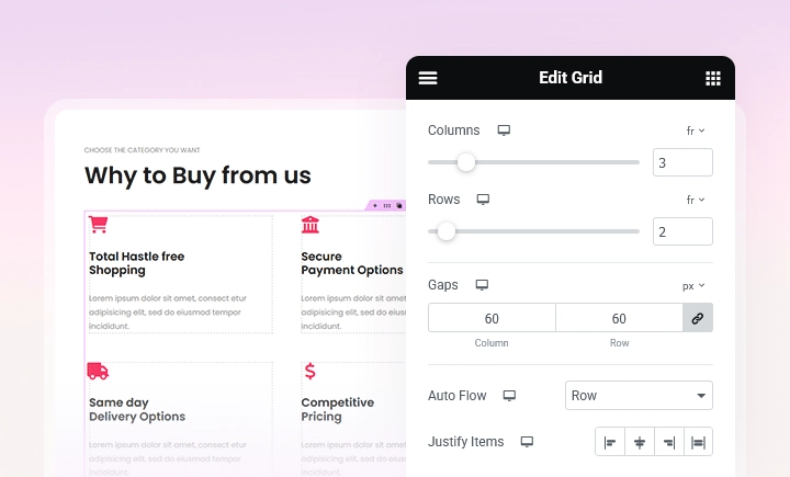
Creative Elements 3.16 introduces several new tools for building more advanced layouts and visual effects.

New Creative Elements design features including Grid Containers, nested elements, masks, and custom units
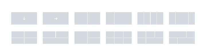
Grid Container predefined layouts
Building with the new Grid container

A Faster Workflow

Some of the most useful improvements in this release are designed to save you time during everyday editing.

Here's what's new for a faster workflow:

Small changes on their own, but together they make everyday work in the Editor noticeably smoother.

Responsive Design, Made Easier

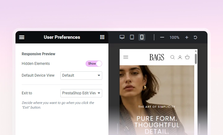
The new Responsive Mode makes it easier to switch between devices and fine-tune your designs for desktop, tablet, and mobile.

You can choose your default responsive device, control whether hidden elements remain visible while editing, and adjust more settings individually for each screen size.

Responsive Mode in the Creative Elements editor
New Responsive mode

A Fresh Look for Creative Elements

You'll notice the difference as soon as you open Creative Elements. The Live Editor and other Creative Elements screens have received a new color scheme, with a cleaner and simpler interface optimized for accessibility.

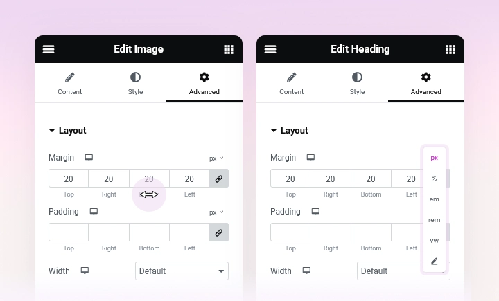
Number Scrubbing and additional size units

How to Update?

The new Creative Elements version is available now. You can update directly from your module manager and start benefiting from the new performance improvements immediately.

Start with the quick win: enable Optimized DOM Output and Dynamic Library Loading for your existing layouts.

Then, when you're ready, explore Flexbox Containers in our Playground and start using the new layout system for new designs or gradually convert your existing pages.

Welcome to the next generation of Creative Elements.

Explore More Updates