Welcome to Containers Playground
Try it out to see how you can use Flexbox Containers on your next website.
In this playground, you will go through 10 lessons where you can learn about all the new capabilities available to you with the new feature.



Your Mission: Change the Direction
You can easily change the direction of your items from being stacked in a column to a row, in just a few clicks.
- Click the Container with the shapes in it
- In the Layout Tab, go to the ‘Items’ Section
- Change the direction to Row
Your Mission: Align to Flex End
When the direction is set to Row, you can change the alignment of items in the Container to the top, middle, or bottom of the Container.
- Click on the Container,
- In the Layout Tab, go to the ‘Items’ section
- Align Items to Flex End
Your Mission: Add Equal Spacing Around
You can also easily and equally adjust the distance between your items and the Container’s edges.
- Click the Container
- In the Layout Tab, go to the ‘Items’ Section
- Justify Content to Space Around.
Your Mission: Wrap Content
While in row, you can set your items to wrap so that items drop to the next row and fit in the Container comfortably.
- Click the Container
- In the Layout Tab, go to the ‘Items’ Section
- Click Wrap
Be a Hero and Try It Out
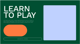
Change the Hero Container’s direction so that all items are in a row, with the heading, text and button stacked on the left.
Hidden
- Click the ‘Hero’ Container
- In the Layout Tab, go to the ‘Items’ section
- Change the direction to Row
learn to play
Lorem ipsum dolor sit amet, consectet adipiscing elit,sed do eiusm por incididunt ut labore et dolore magna aliqua. Ut enim ad minim veniam, quis nostrud exercitation ullamco laboris nisi ut aliquip ex ea sint occae cupidatat non proident, sunt in culpa .

Flip Content With Ease
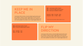
Take the second Container and switch its direction.
Hidden
- Click the ‘Second Content’ Container
- In the Layout Tab, go to the ‘Items’ Section
- Change the direction to Reverse Row
Keep Me in Place
Lorem ipsum dolor sit amet, consectet adipiscing elit,sed do eiusm por incididunt ut labore et dolore magna aliqua. Ut enim ad minim veniam, quis nostrud exercitation ullamco laboris nisi ut aliquip ex ea sint occae cupidatat non proident, sunt in culpa fringilla semper nisi.
$00 - Lorem ipsum dolor sit amet
$00 - Consectet adipiscing elit sed do
$00 - Eiusm por incididunt ut labore
Group 01 - Wed - Thu 4pm - 5pm
Group 02 - Mon - Fri 5pm - 6pm
* Quis nostrud exercitation ullamco laboris nisi ut
Flip My Direction
Lorem ipsum dolor sit amet, consectet adipiscing elit,sed do eiusm por incididunt ut labore et dolore magna aliqua. Ut enim ad minim veniam, quis nostrud exercitation ullamco laboris nisi ut aliquip ex ea sint occae cupidatat non proident, sunt in culpa fringilla semper nisi.
$45 \ Lorem ipsum dolor sit amet
$160 \ Consectet adipiscing elit sed do
Mon - Tue 6pm - 7pm
Wed - Fri 6pm - 7pm
Build Your Nests
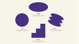
Let’s create a layout that includes Nested Containers, with different layouts.
Hidden
- Click the ‘Gallery’ Container
- In the Layout Tab, go to the ‘Items’ Section
- Change the direction to Row
- Align the items to Center
left
Malesuada fames ac turpis egestas integer
eget aliquet nibh. Egestas maecenas
Center
Malesuada fames ac turpis egestas integer
eget aliquet nibh. Egestas maecenas
Center
Malesuada fames ac turpis egestas integer
eget aliquet nibh. Egestas maecenas
Right
Malesuada fames ac turpis egestas integer
eget aliquet nibh. Egestas maecenas
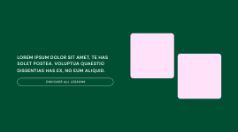
Stairway to Success
Try aligning the middle square widget to the top of the Container.
Hint - Adjust the layout of the specific widget.
Hidden
- Click on the middle image (square) widget
- In the Advanced Tab, Align Self to Flex Start
Lorem ipsum dolor sit amet, te has solet postea. Voluptua quaestio dissentias has ex, no eum aliquid.

Mobile Responsive Layout
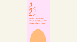
Choose a custom order for each device without duplicating content. Place the image last, under the CTA button in mobile.
Hidden
- Click on the ‘Oval Image’ Container
- In the Advanced Tab, in ‘Order’ Control, adjust
the breakpoint to Mobile - Once in Mobile Mode, change the ‘Order’ to end, using the arrow
Mobile view
Lorem ipsum dolor sit amet, te has solet postea Voluptua quaestio dissentias has ex no eum.
It’s a Wrap
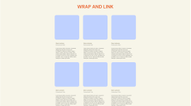
When you arrange items in a row - they won’t always fit to one row. Let them wrap to the next row to fit nicely on the screen, You’ll also have to adjust the Heading so its width is 100%.
Bonus - you can hyperlink each of the cards with the HTML Tag.
Hidden
- Click on the ‘Cards’ Container
- In the Layout Tab, go to the ‘Items’ Section
- Click the Wrap button
- Click the ’WRAP AND LINK’ Title widget, and in the Advanced tab, set its width to 100%
- Click the ‘Add Hyperlink’ Container
- In the Layout Tab, in the ‘Additional Options’ Section set the HTML Tag to ‘a’
- In the ‘Link’ field that becomes exposed, you can add any link
Wrap and link
Name Lastname
Professional Tittle
Lorem ipsum dolor sit amet, consectet adipiscing elit,sed do eiusm por incididunt ut labore et dolore magna aliqua. Ut enim ad minim veniam, quis nostrud exercitation ullamco laboris nisi ut aliquip ex ea sint occae cupidatat non proident, sunt in culpa qui officia mollit natoque t massa quis enim.
Name Lastname
Professional Tittle
Lorem ipsum dolor sit amet, consectet adipiscing elit,sed do eiusm por incididunt ut labore et dolore magna aliqua. Ut enim ad minim veniam, quis nostrud exercitation ullamco laboris nisi ut aliquip ex ea sint occae cupidatat non proident, sunt in culpa qui officia mollit natoque t massa quis enim.
Name Lastname
Professional Tittle
Lorem ipsum dolor sit amet, consectet adipiscing elit,sed do eiusm por incididunt ut labore et dolore magna aliqua. Ut enim ad minim veniam, quis nostrud exercitation ullamco laboris nisi ut aliquip ex ea sint occae cupidatat non proident, sunt in culpa qui officia mollit natoque t massa quis enim.
Name Lastname
Professional Tittle
Lorem ipsum dolor sit amet, consectet adipiscing elit,sed do eiusm por incididunt ut labore et dolore magna aliqua. Ut enim ad minim veniam, quis nostrud exercitation ullamco laboris nisi ut aliquip ex ea sint occae cupidatat non proident, sunt in culpa qui officia mollit natoque t massa quis enim.
Name Lastname
Professional Tittle
Lorem ipsum dolor sit amet, consectet adipiscing elit,sed do eiusm por incididunt ut labore et dolore magna aliqua. Ut enim ad minim veniam, quis nostrud exercitation ullamco laboris nisi ut aliquip ex ea sint occae cupidatat non proident, sunt in culpa qui officia mollit natoque t massa quis enim.
Name Lastname
Professional Tittle
Lorem ipsum dolor sit amet, consectet adipiscing elit,sed do eiusm por incididunt ut labore et dolore magna aliqua. Ut enim ad minim veniam, quis nostrud exercitation ullamco laboris nisi ut aliquip ex ea sint occae cupidatat non proident, sunt in culpa qui officia mollit natoque t massa quis enim.
You’ve made it!

Congratulations!
Now that you’ve mastered the basics of Flexbox Containers you’re all set to put your knowledge to work. Start playing in your testing environment and use your Flexbox tools to create a unique and top-performing website.